|
A Closer Look
  
The SteelPad 4S comes in an envelope style package and whilst the pad is displayed on the front along with images from a few games, it doesn't prepare you for how sleek and silently stylish it appears in person. When you look at the images of the pad on the 'net you probably think 'yeah, it's black, looks pretty good' but honestly, going with its black theme its appearance in person is like a stealth attack. It doesn't jump out and shout here I am but rather quietly smiles confidently that it means business.
  
Despite the name SteelPad, the 4S is actually made from 3.5mm aluminium which gives it a nicely proportionate weight when compared to its size, being just right to offer a firm grip with the desk below. Looking at the front of the pad we can its perfect matt black finish and in the lower left corner the striking '4S Steel' logo.

The logo unlike earlier versions of the SteelPad is now laser burned into the pad where as previously it was a sort of button affair which could easily hinder mouse movement (most likely at a critical moment :) ). One thing I shall point out here is that you think something like this would get covered in fingerprints easily but it is actually the reverse. Any fingerprints slowly fade away after a few seconds back to the matt black finish. I've no doubt that over time the build up will prevent this from happening but still thought it worth a mention.
 
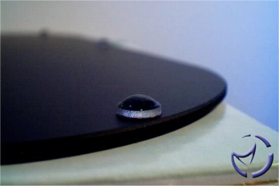
Turning the pad over we see more of the matt black finish and 8 what I believe to be very hard rubber 'nipple' like feet (calm down &.). At first I was a bit sceptic about the effectiveness of these feet since they do appear to be glossy and half spherical which generally means less traction. However they do in-fact grip well, complimented with the weight of the pad itself.

The overall curved shaping you find on the outer reaches of the pad extends to the edge and corners of the pad, no doubt to protect users from sharp edges as well as keep in theme with the good looks and optimum mouse area. This is definitely one sexy looking mouse pad and I for one am pleased at the absence of some huge logo taking up the majority of the front surface, leaving it clean and professional looking.
Previous Page - Introduction
Next Page - In Use and Final Words
|
 SteelPad 4S Mouse Surface: Not satisfied with the performance of a generic mouse users will often spend quite a bit of greenback to gain an edge. So why not do the same on a mousing surface?